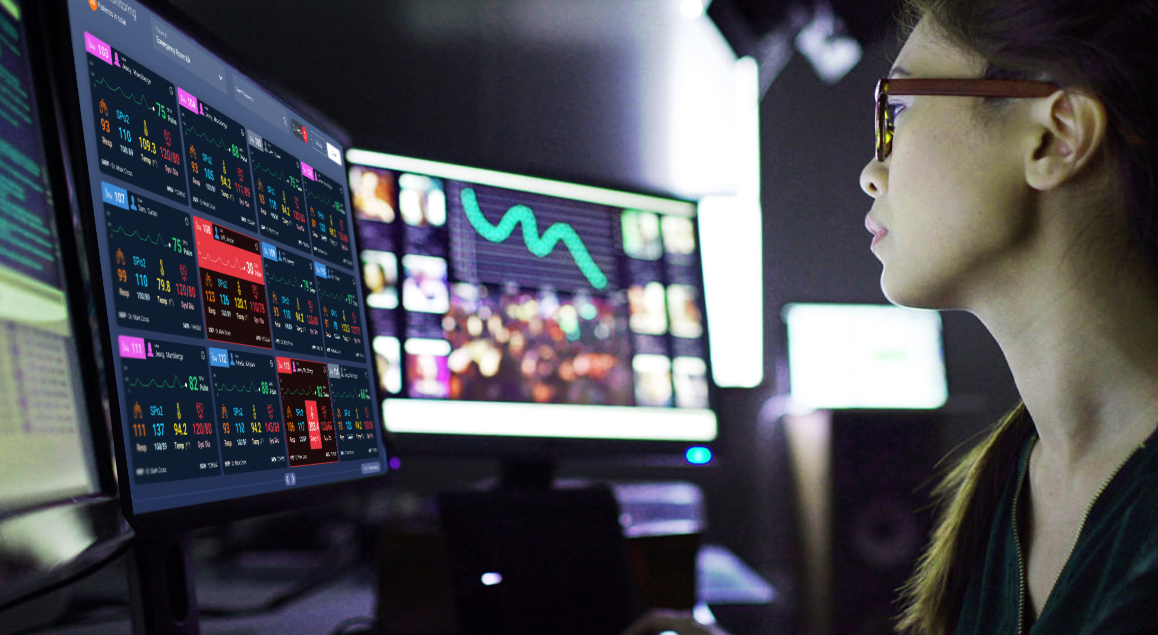
Improving accuracy & visibility of patient vitals assessment
Project Overview
VIDA "Life" is an enterprise-grade healthcare product suite which is been developed as a cloud hospital management system by Cloud Solutions in Sri Lanka which is the technology partner for Cloud Solutions UAE a subsidiary of Dr. Sulaiman Al Habib Medical Group (HMG) the largest medical group in the gulf area.
Problem
The healthcare workers in the Emergency Room (ER) have to keep an eye 24/7, 365 days on the patients that are been treated in the unit. There was no proper solution to monitor & assess the health conditions of patients from a single location in the ER unit.
My role
This was a team effort which i led and collaborated as a UX designer. Areas covered are Research, Ideation, Testing and UI design.
Time
1-2 Weeks
Tools
Pen & Paper, Wireframe.cc, InvisionApp
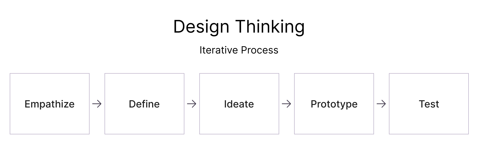
As one of the senior UX designers in the team, myself and my team we had the opportunity and the liberty to design one of the coolest features of the healthcare system as a concept back in 2018. Since the solution for the problem was needed within a short period of notice We had to follow a rapid Design Thinking Process which we come-up with a solution in less than a week.
Design Thinking
Empathize.
Before we began on the research it was important for me to set research goals to stay current and relevant to the task. Conducting the research based on business goals will keep us aligned to the challenge.
Business Goals
Design a solution that helps ER users to monitor patient’s vitals and other conditions 24/7
Design a solution that can be viewed on large screens
Ensure the solution caters to patient safety
The solution should be touch-friendly for a seamless user experience
Design a solution with a modern UI
Ensure the overall better user experience
Couple of assumptions we had…
Physicians are super busy and they would need to view much as possible patient data at a single glance
The solution would need a touch-friendly interactive approach
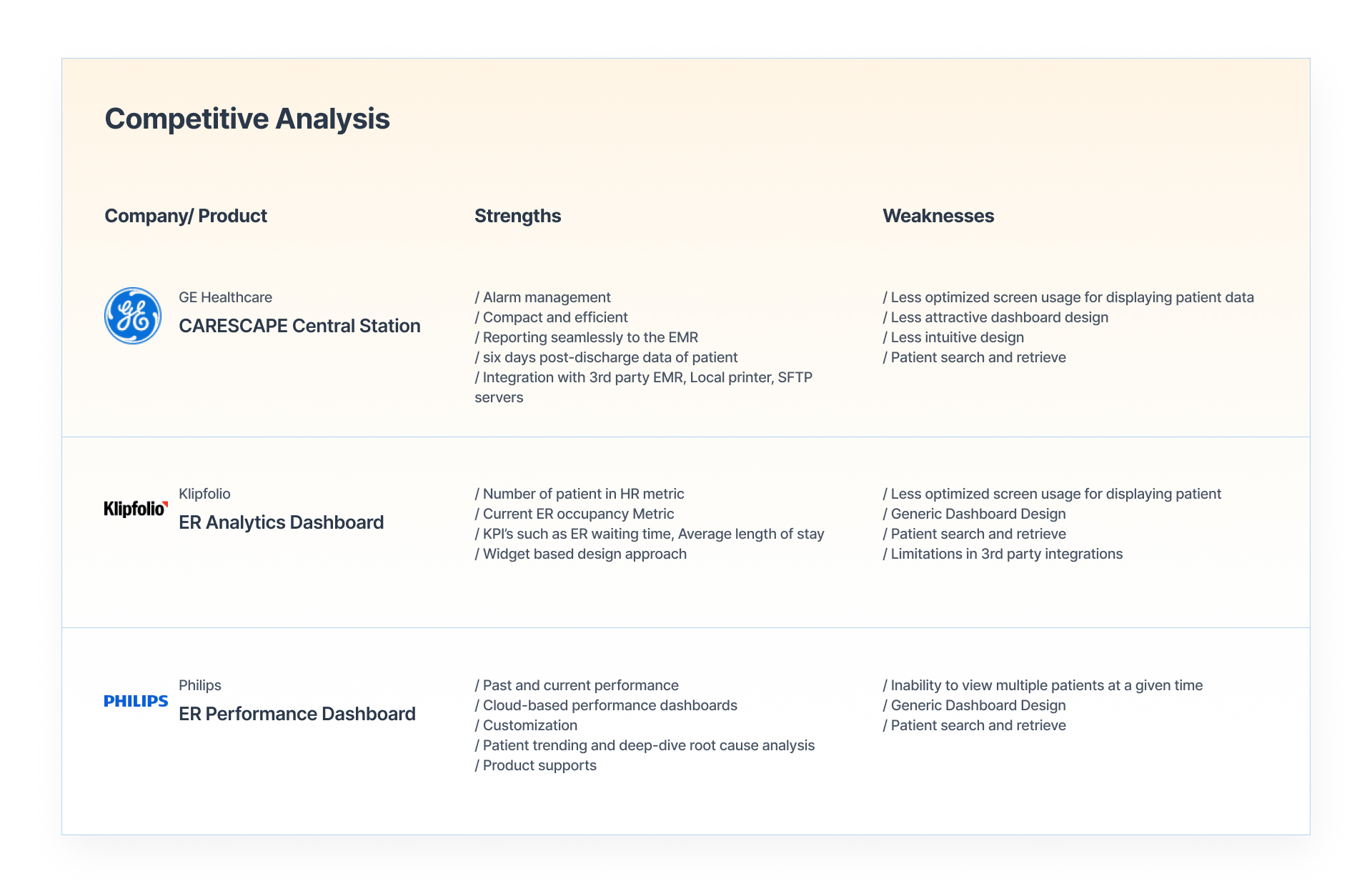
Competitive Analysis.
We began to research similar digital products out there in the market since this feature was new to us. Our goal was to identify a few market giants out there and to understand what are the core features, strengths, and weaknesses.
Note: Based on the time limitation we had to limit our exploration to 3 products found on the market. It was tough to find products similar to this exact requirement.
Design Thinking
Define.
Synthesize.
First and foremost we tried to understand the business goal, and then understood the user’s needs, pain points, and goals. At this moment myself and my team conducted market research and competitive analysis for the product suite. Apart from that, we were able to narrow down the user’s needs, pain points, and goals based on the user interviews and email surveys carried out by a few ER physicians who work closely with the product engineering team.
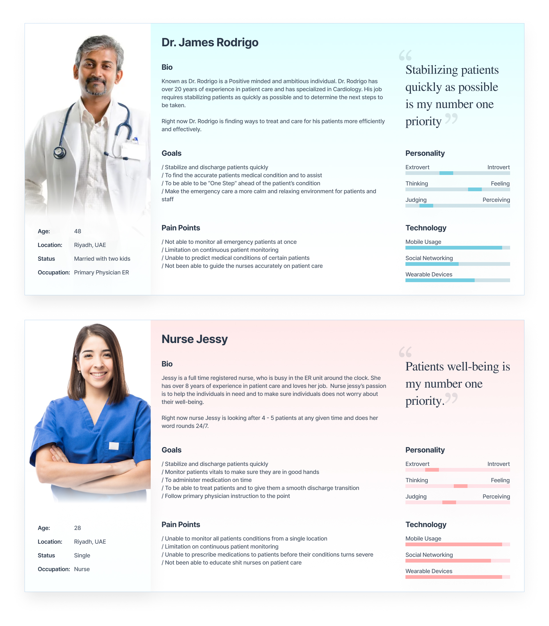
Based on the research findings here are two of the fictional personas we created for better empathy and storytelling for development.
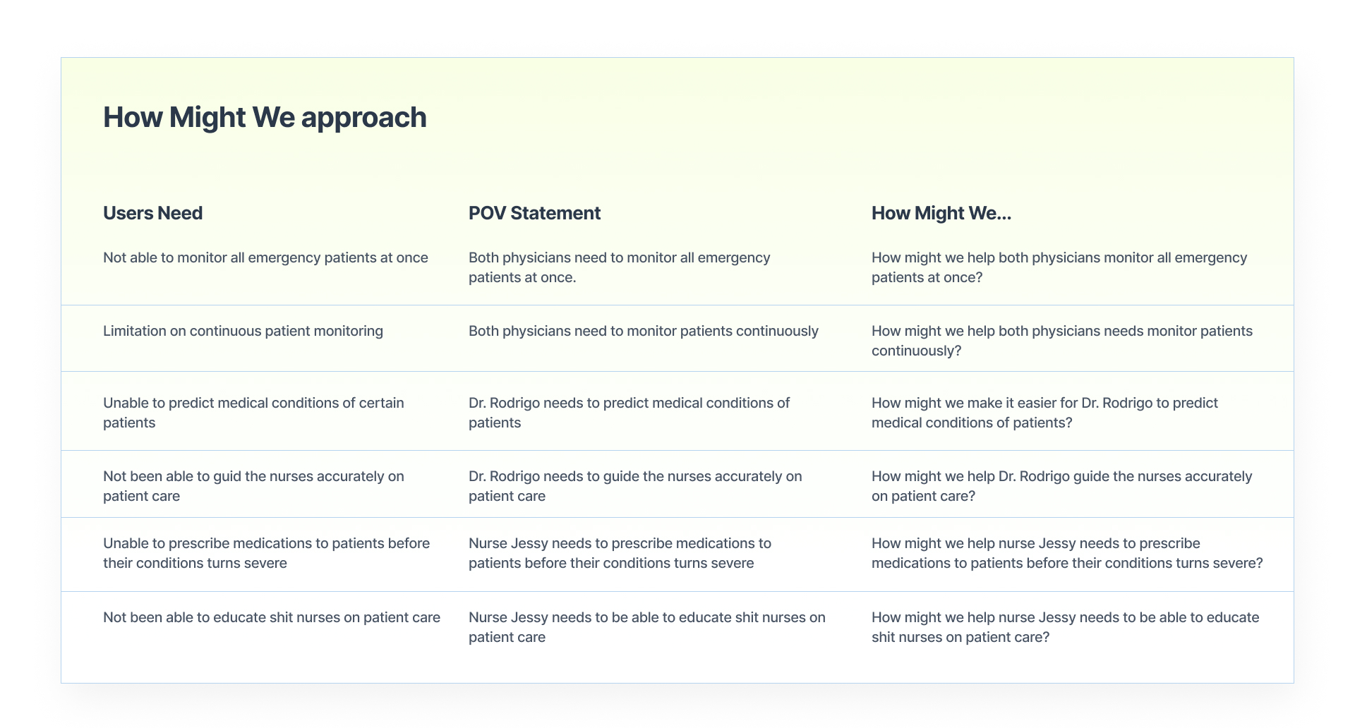
Defining Problems.
Based on the key problems identified by the primary physician and nurse, Dr. James & Nurse Jessy it was time to define the problem statements.
For this we used a Point of View Statement (POV) method to come up with the How Might We… questions.
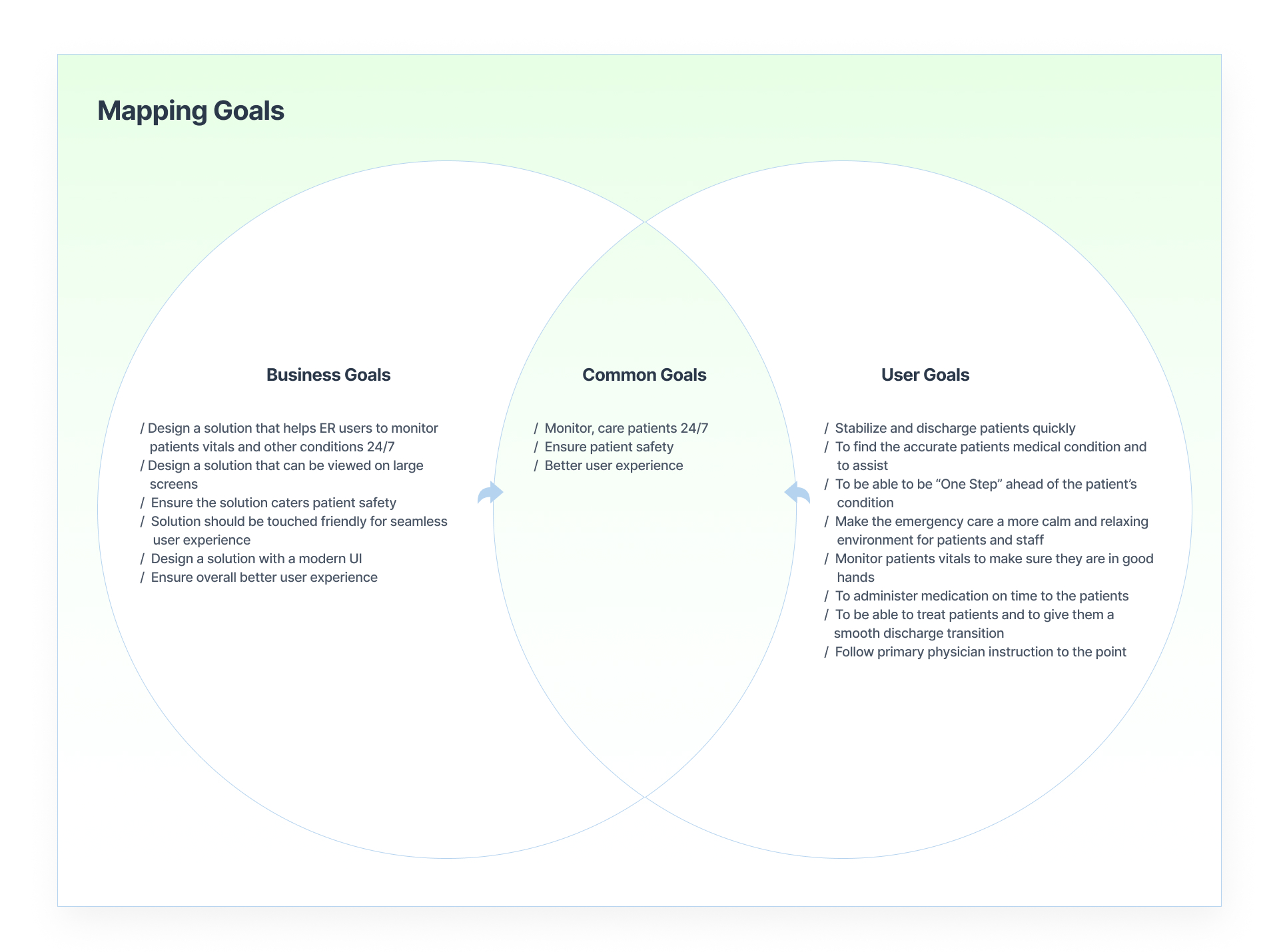
Mapping Goals.
Once we were able to gather the Goals and Pain points of the users we were then keen to understand if there are any similarities between the Business Goals and the User goals. Hence we came up with this diagram to map the goals to ensure a way forward.
Key Takeaway:
This helped us to understand the goals that are in common with both stakeholders.
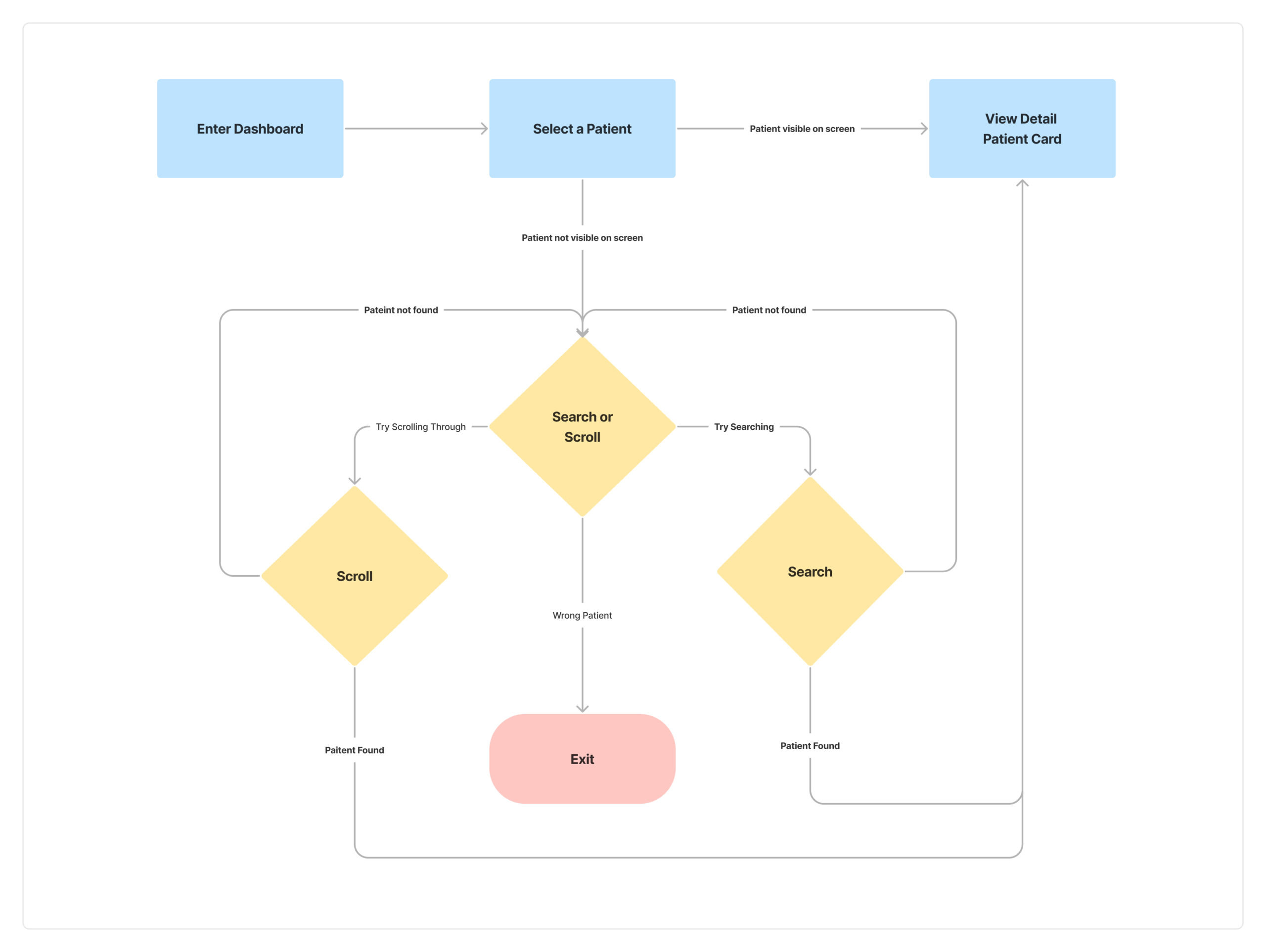
User Task Flow.
Next up to understand the way forward we drafted the ideal user task flow for the dashboard to understand how Dr. Rodrigo & Nurse Jessy would interact in different stages and decision points.
Key Takeaway:
The use of a user task flow, helped us to understand the main touch-points and decision-making scenarios.
Design Thinking
Ideate.
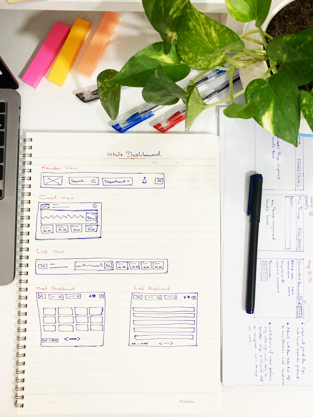
Sketching.
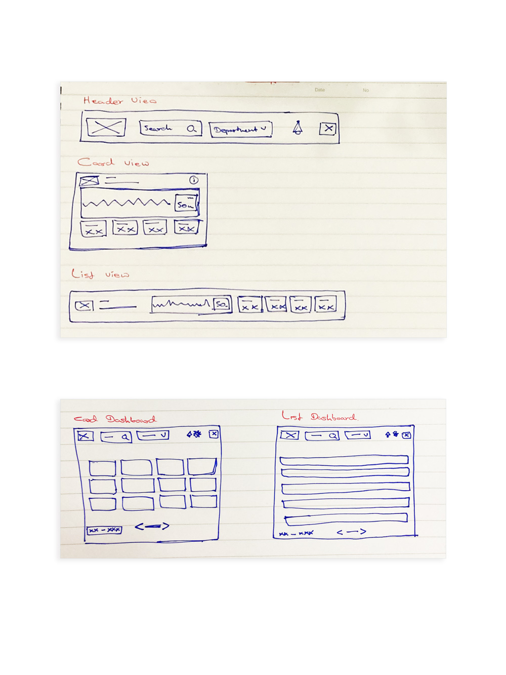
One of my personal favorite phases in the process is to think out of the box and come up with all sorts of ideas! We had a few ideas and we got them all down on pen & paper before i forgot them. The scribbled-off ideas, throw away paper sketches are not here 😛
Key Takeaway:
Based on the sketched idea got some feedback from colleagues through A/B testing and went forward with the Card view & Card Dashboard.
Design Thinking
Prototype.
Wire-framing.
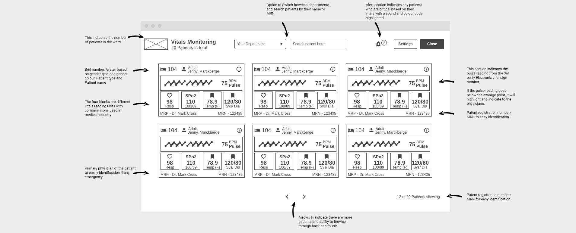
The next phase was to design the sketches into a detailed Hi-Fi wire-frame prototype. The prototype helped me to run a few testing rounds with few selected users.
Wire-frame Iterations...
Based on the research findings, ideas and discussions, we focused on few amendments to the above dashboard view:
Improved patient card
Improved search
Improved navigation
Improved patient card
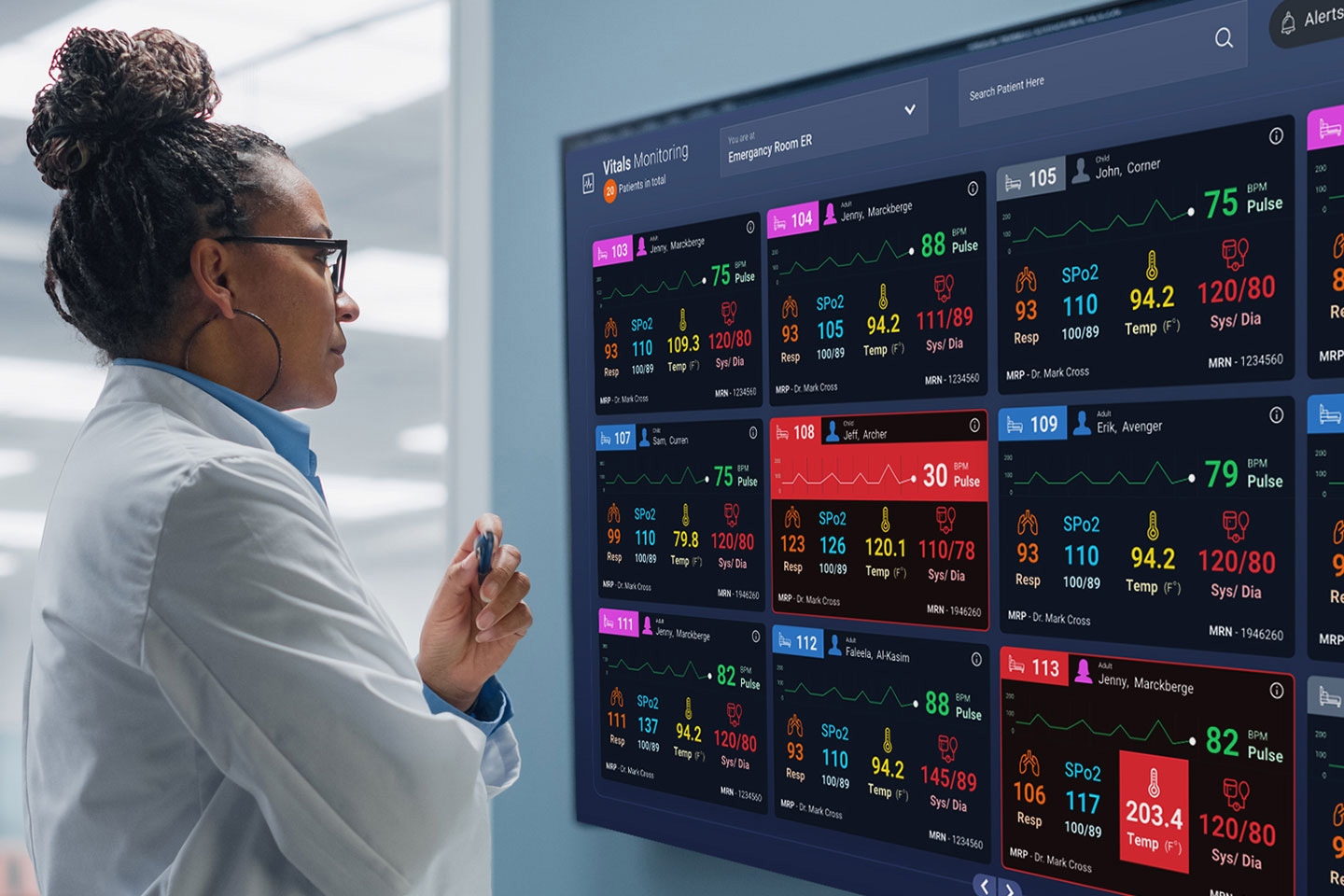
We figured out that the physicians and nurses in a hospital identifies their patients primarily by bed number. Hence included the bed number and and patient gender is indicated with standard gender colors for quick identification. Also based on the research findings we included the most commonly used vitals as indicators on the patient card.
Improved search
Even though the dashboard solution was designed for the ER unit, we thought through about the solution as a holistic solution. Hence added a patient search along with a department selection.
Improved navigation
How can we show all the patient on the screen? Can we cramp up our design to do this? well the solution that we came up was not to make the design look cluttered but to make it more intuitive. Hence added arrows to indicate there are more patients to be seen and for easy touch friendly navigation. A dynamic label on the patient count indicates the current state.
Design Thinking
Testing.
Usability Testing.
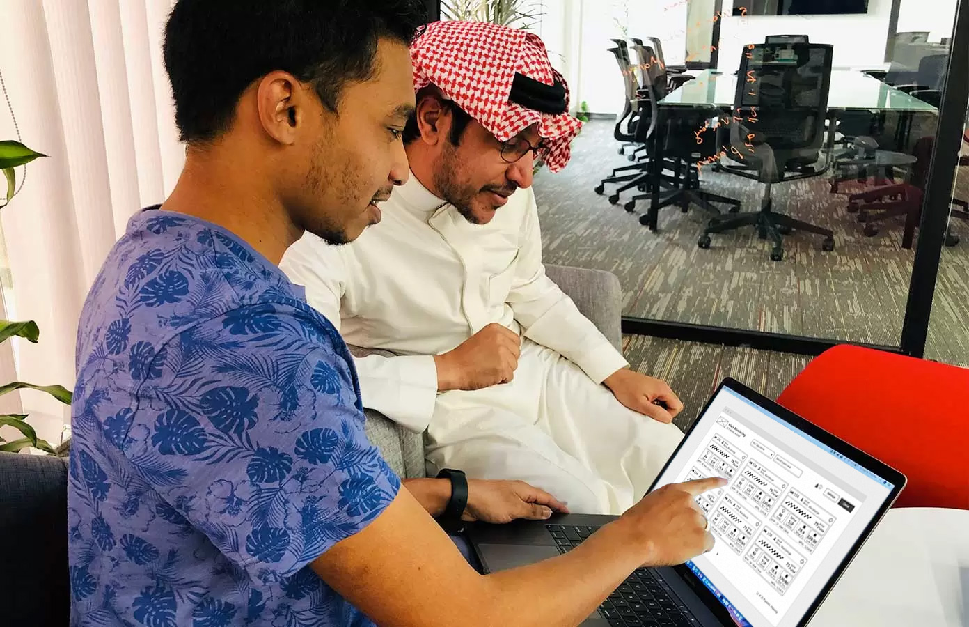
At the time of designing a solution for the vitals dashboard, few of us were required to fly over to Riyadh head office to visit the hospital chain for various requirement gatherings and workshops.
We made use of this opportunity to test and validate the design with one of the physicians who was kind enough to spear some time.
Test Objectives were,
Explain the goals & problems of the scenario
Observe if the user can understand the solution
Gather insights on what’s done right and wrong
Gather info on usability improvements from user’s perspective
Test Summary,
Method of testing: Show and Tell (Lab Usability Testing)
Participants: 3 – 4 (1 Physician & few design team colleagues,QA, PM, CEO)
Average test time per user: 15 Minutes
Testing the Wire-frame prototype with a physician who was kind enough to spare some time to provide feedback.
User test results
Users were not sure if this solution is a touch solution
Few users were not sure if this solution would fit into different screen sizes
Physicians wanted to view more patients
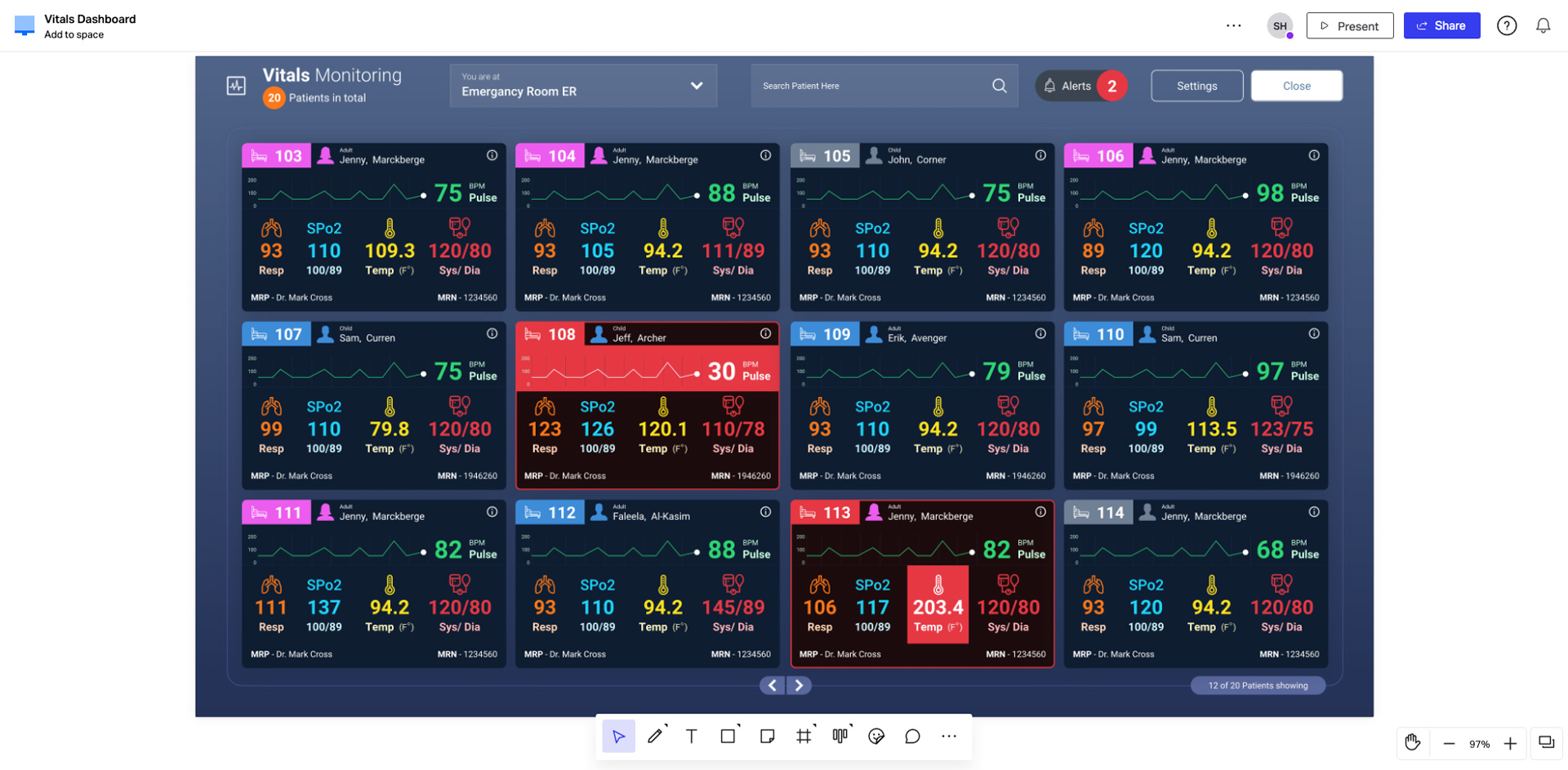
Revisions for the results
We made sure the UI elements in the solution were touch-friendly
Made sure the design was responsive and adopted different screen sizes (Ex: from Monitors to large TVs)
Made sure the navigation and patient indication were prominent to support the mental model
Revisions on the Final Design
Once all the user insights were gathered on the prototype We started designing the final visual design using Invision App.
We made sure to accommodate the revisions in the final design below.
The final design output on InvisionApp! Oh we loved it...
Project Reflection.
One of few projects that I completed based on the Design Thinking Process all by my-self.
The Design Thinking approach helped me identify the company goals & end user's pain points, goals at the very beginning helped me to ideate and test out the solution with minimum iterations.
This was one of my very first projects working on InvisionApp and I loved every bit of the experience.
What could have been done better.
/ We could have used a more lighter color pallet to improve usability.
/ The UI designing could've been smoother if we had followed a component & variable approach.
/ We could have designed the visual layouts prior to the user testing so that we could have tested for a better understanding of the experience with colors & interactions.
/ We could have used a mental model such as the Think Aloud method to get a more accurate output.