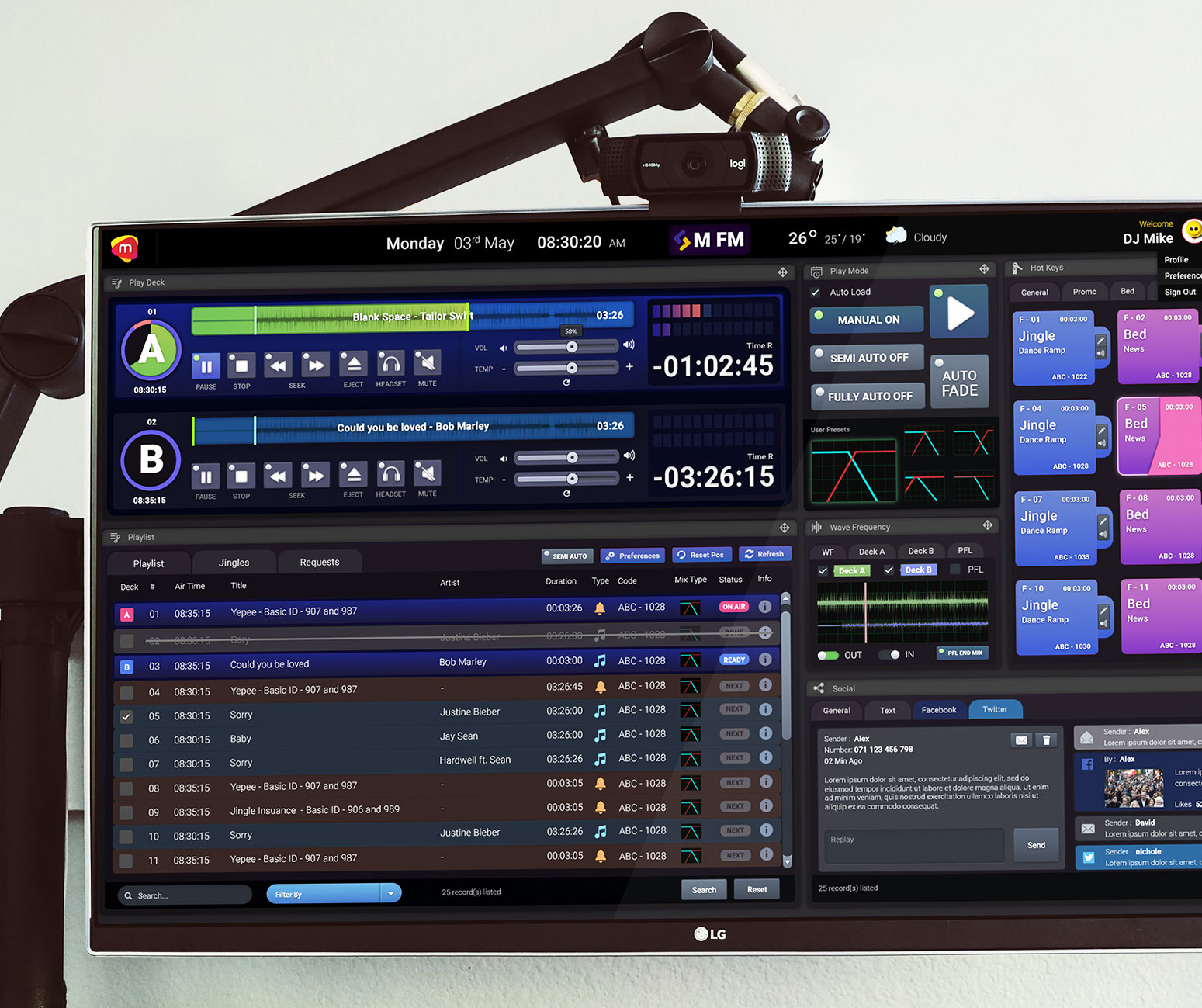
Redesigning a play out console to improve radio presenter's engagements with listeners
Project Overview
Microimage was a leader in digitizing Human Capital Management (HCM) as well for redefining Radio Broadcasting in the Asia pacific region. Back in 2016 i got the opportunity to work with a few core stakeholders in the organization to design a modern aged Radio DJ console.
Problem
Radio DJ’s were unable to communicate & connection with listeners through the existing app.
My role
This was a project that i got involved in with couple in stakeholders. I contributed in UX research, Ideation, UI design
Time
3-4 Weeks
Tools
Pen & Paper, Photoshop, Google Form
Goals.
As a part of the team, myself as a UX designer along with the CEO, Product Owner and UX Lead we had to identify out goal behind the redesign approach for the platform. To do so we started off by answering a couple of questions…
Before we come up with the Goals/Outcomes we need to;
- To understand the problems that we are trying to solve?
- Understand who will be using this product and why?
- What are the customer expectations, needs?
- Are there any specific business requirement we need to consider?
- What’s the timeline?
To find the answers for the above we began by reaching out to few potential users.
Research.
Users Problems.
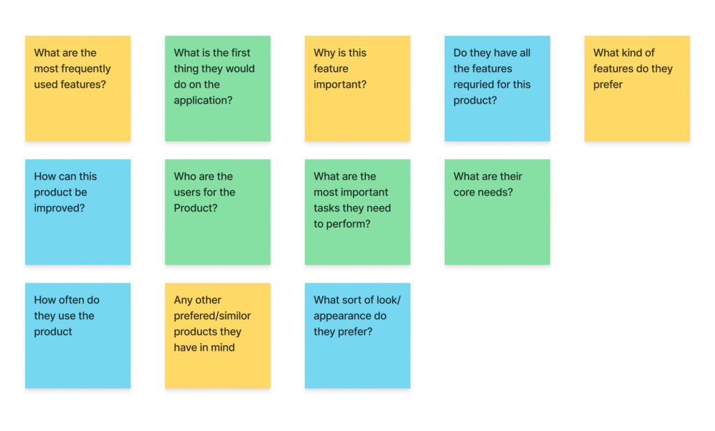
Before we actually went over to the Radio presenters we wanted to align our selves first by listing down what sort of questions we believe we wanted to ask them.
here are couple of questions we put down;
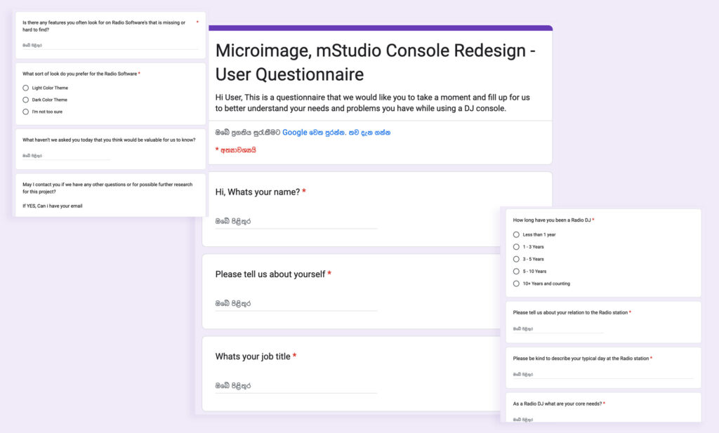
based on the list of questions we came up with, it was my responsibility to come up with a questionnaire in the form of a Google Form to be shared with a couple of Radio DJ’s within our networks.
Problem statement.
Based on the gathered information from users through the questionnaire, myself and my team we put together the problem statement.
” DJ Mike is a energetic Radio DJ who needs a easier way to perform his routine tasks such as playing music & jingles because he wants to engage & entertain his listeners better than how he performs now. “
Competitive Analysis.
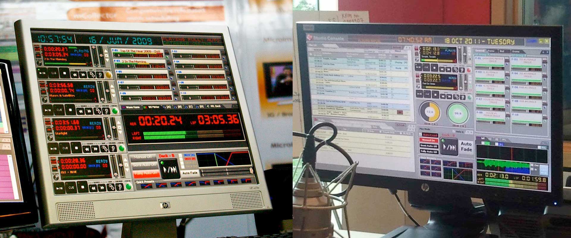
Based on the internal stakeholders references and user questionnaire feedback, Myself and my team, we were curious to analyze couple of competitive products out there for Radio DJ Software’s.
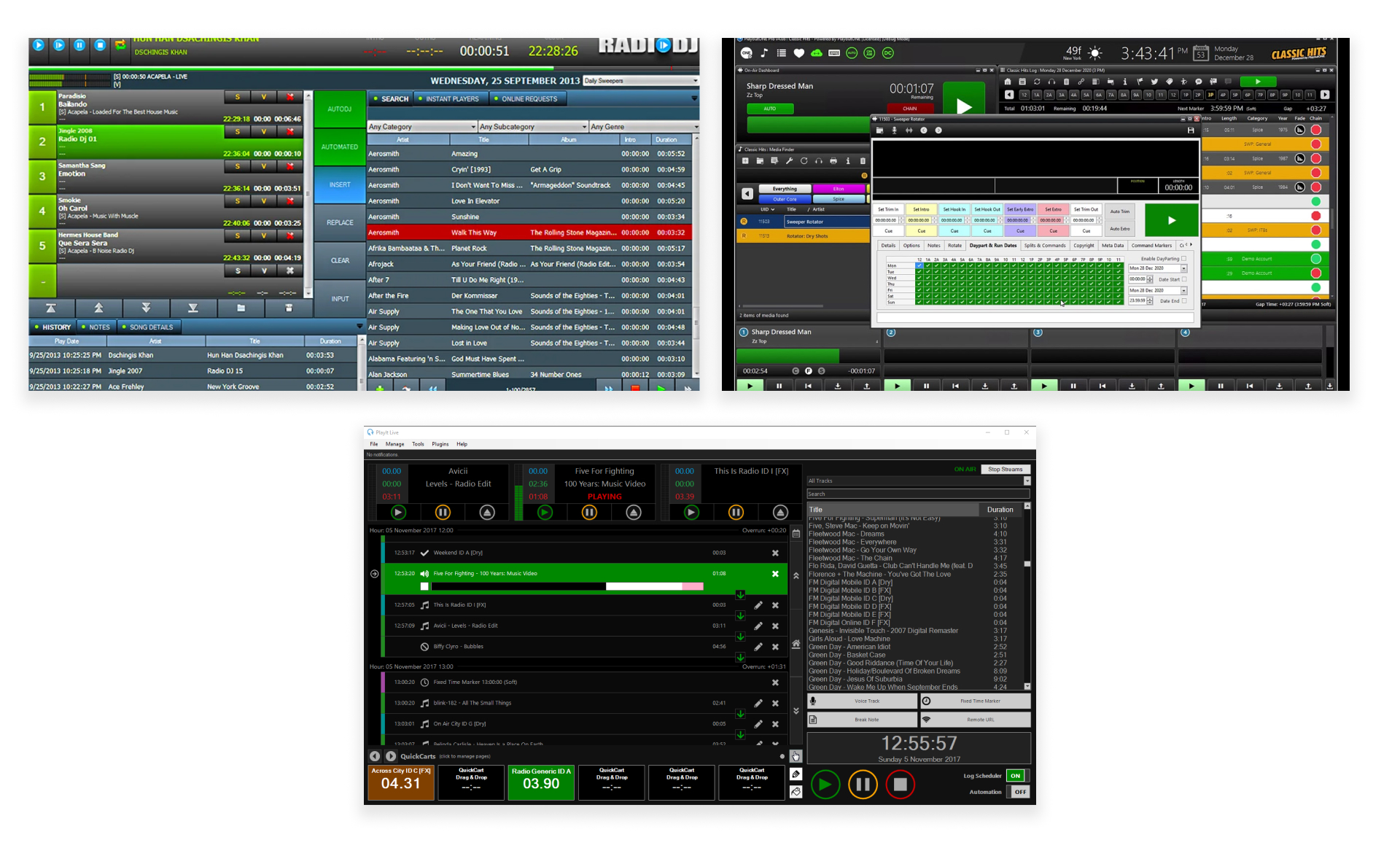
Based on the findings we noticed couple of user needs addressed in different ways on the above platforms;
- The ability to play/queue couple of songs on the player with equalizer option
- Ability to manage & play advertisements/ Jingles
- A sophisticated music library
Concept.
Sketches.
I was able to initially draw a couple of concepts to present to my CEO, PM and Lead Designer to begin with.
We analyzed these variations based on the needs we had to address.
Key Takeaway:
Conceptualizing ideas through rapid sketches/ Low-Fi Wire-frames helped me Conway the ideas easily to my internal stakeholders.
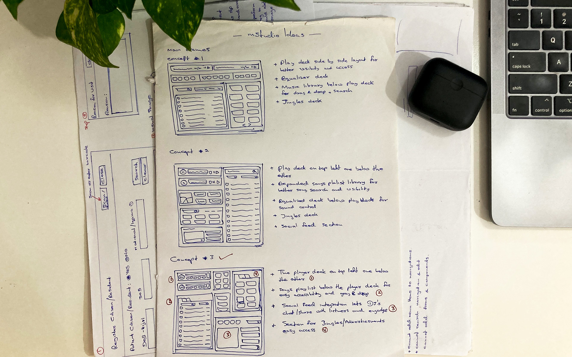
It was indeed a collaborative session where rapid sketching, validating took place with the team. As seen above i focused on the main DJ play out screen focusing on the Music player deck, Music Library, Equalizer and the Jingles player.
Finally we agreed to proceed with Concept #3
Few key concerns from the concept #3 then was researched;
Concern #1
Will the player deck be more relevant one below the other or side by side?
One below the Other was the choice.
At any given time DJ’s queue up to 2 songs to be played back to back. The visibility of the current song and the song next was preferred by DJ’s. And a music library just below the player deck gives easy access and ability to drag and drop songs to the deck.
Concern #2
Should there be a social feed integrated to the screen or not?
3 out 4 DJ’s preferred to have a social feed section on the console. It would be interactive, give them more visibility and improve continuity to go about with their jobs.
Concern #3
Integrated Jingle Play
All 4 users preferred to have a optimized Jingle deck embedded to the console. They also prefer to have the jingles automated to play at specific time intervals.
Prototype.
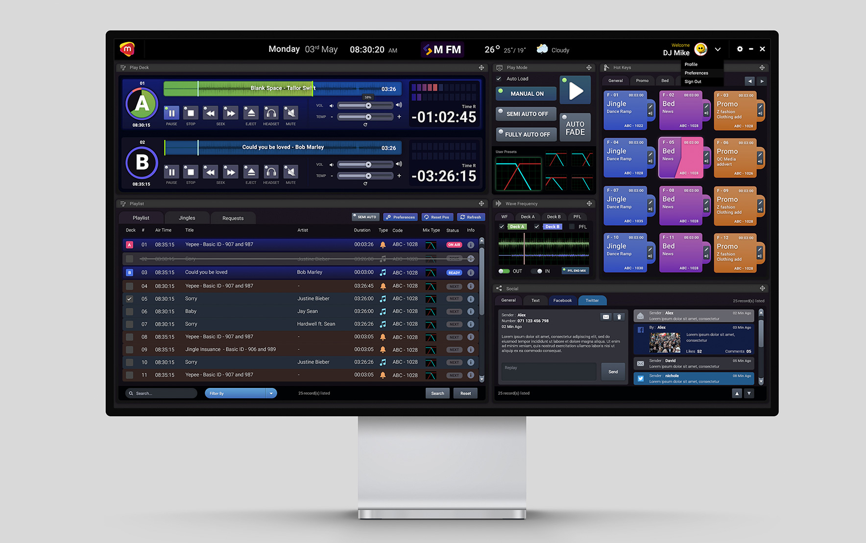
The go to tool for me back in 2016 was Adobe Photoshop 😉 The final dashboard concept was designed with soft hands and with lots of patients.
Key Takeaway:
Looking back i realize why tools such as Adobe PS and Illustrator are not intuitive & recommend to use to design digital product because of the limited features and flexibility in design it has.
Project Reflection.
Designing for a radio platform is on a different level. As the only junior designer of the organization i was able to brainstorm and ideate with internal stakeholders such as the CEO, PM, Lead Designer to design a console that not only addressed DJ artists need but also was able to meet business expectations.
Starting off with rapid prototyping through sketches helped me visualize this complex UI design before hand. This was by far the most complicated design I’ve done using Adobe PS back in the day.
I’m happy how the solution turned out that supported the core needs of the DJ artists.
What could have been done better.
/ I could have designed the console with Sketch or Adobe XD to save time and energy.
/ I could have made the prototype interactive to get more in-depth test results from stakeholders for Usability.