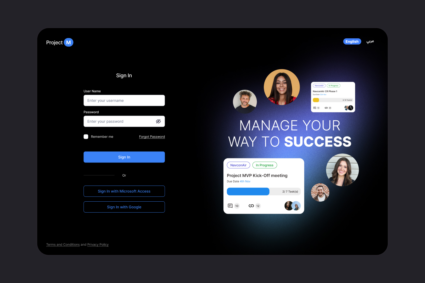
Project management tool for teams
Project Overview
"Project M" is a comprehensive project management and project analytical tool to manage and govern internal projects among teams and individuals.
Problem
Many organization that's handling multiple internal projects does not have the capability to monitor and track project status, deliverables, people in charge and to generate reports based on project performances.
My role
This was a solo design effort which i was the UX/UI designer. Areas covered are Research, Ideation and UI design.
Time
8 Days
Tools
Pen & Paper, Chat GPT, Miro, Figma
As the UX/UI designer of the project, i got the opportunity and the liberty to design a solution for a Internal Project management System. I follow a rapid Design Thinking Process which we come-up with a solution within a week.

Empathize.
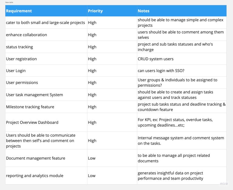
Before i began on the research it was important for me to list down the core requirements and prioritize the list. This process helped me to understand any connected problems and to set the MVP scope.
Business Goal
- To Design a comprehensive project management application for internal usage.
Couple of assumptions i had…
- There should be a Super Admin Portal (Service Design UX) to manage users, permissions and user groups.
- User login to have a SSO (Single Sign On option)
- Permission level should be user level as well as user group level
Requirement Analysis.
I managed to list down the high level requirements to make sure i don’t miss any crucial points. This helps me to stay focus on the requirements to address in the form of pain points to solve.
Competitive Analysis.
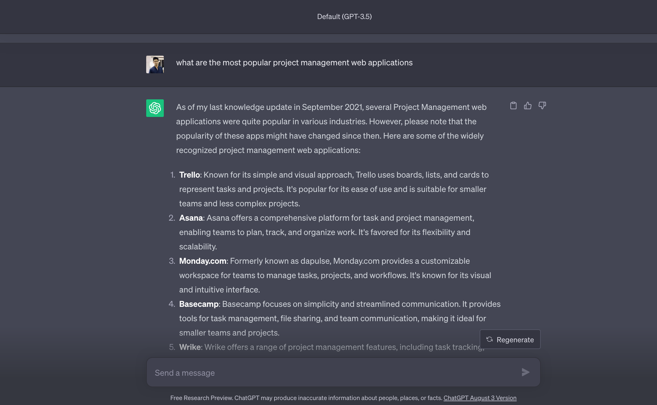
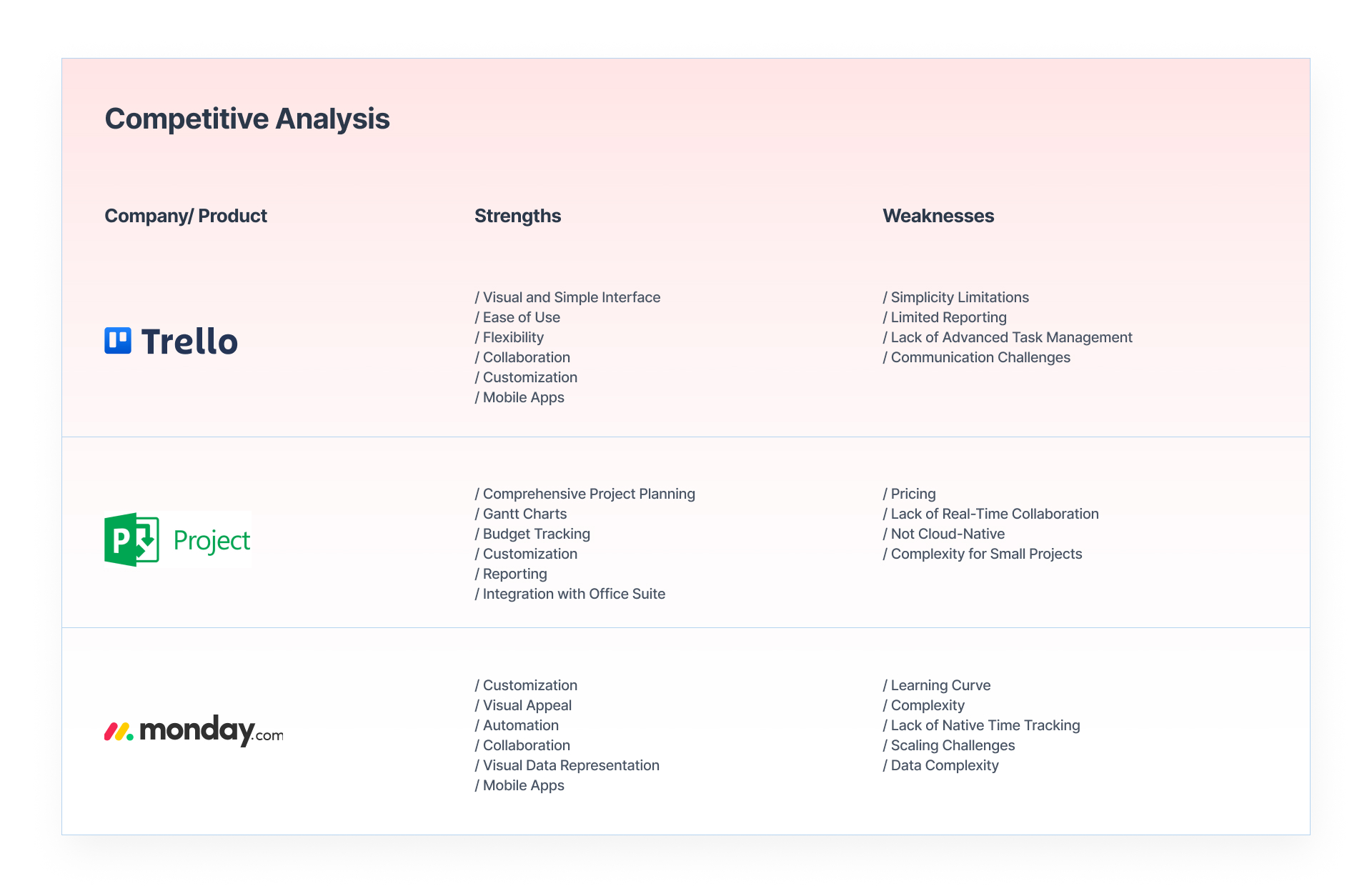
I began to research similar digital products out there in the market with the help of Chat GPT. My goal was to identify a few market giants out there and to understand what are the core features, strengths, and weaknesses with those applications.
Note: Based on the time limitation i had to limit my research activity to 2 days and 2 products.
Define.
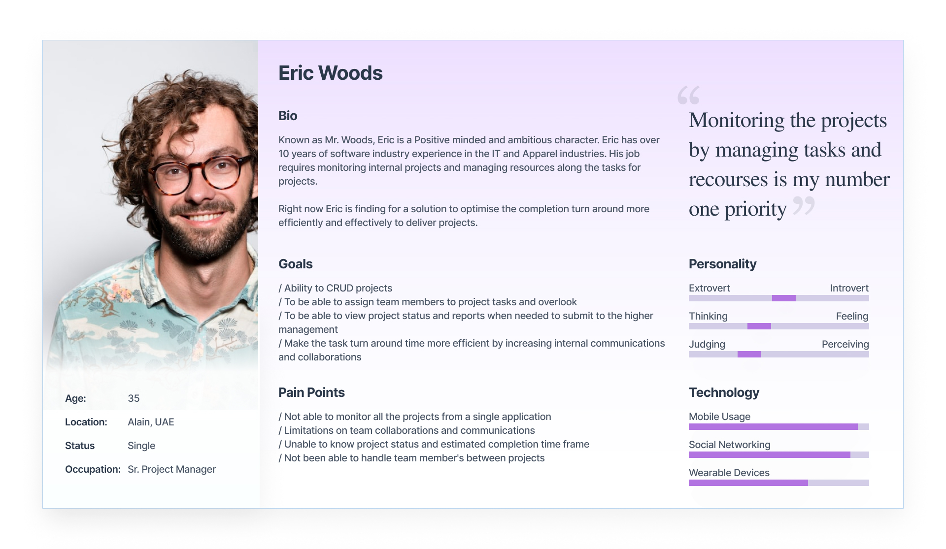
Fictional Personas.
For the ease of the project i created a fictional persona which represents the pain points of a typical project manager. With the help of Chat GPT i was able to understand the target user audience.
Defining Problems.
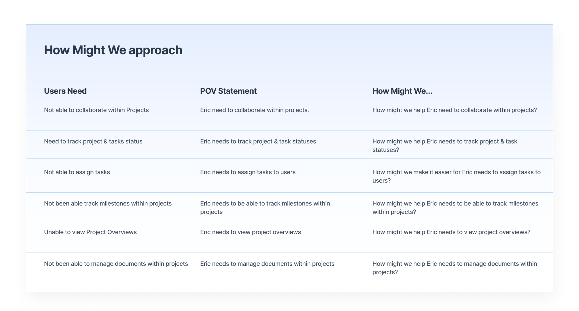
Based on the key problems identified above for the application it was time to define the problem statements. For this i used couple of problems identified for the user “Project Manager”.
For this i used a Point of View Statement (POV) method to come up with the How Might We… questions.
Solution Diagram.
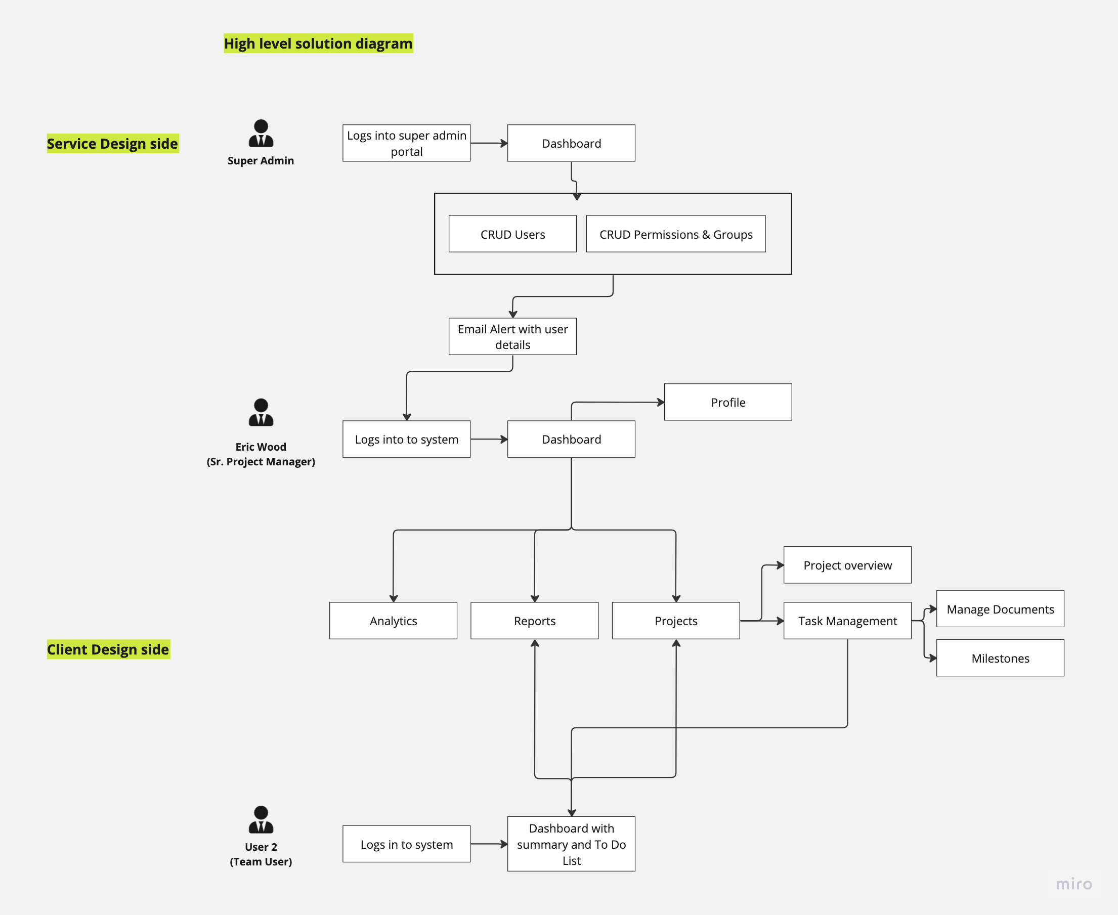
Next i analyzed the entire solution and drafted a diagram which i call the UX solution diagram which connects primary touch points and connections between the key user touch points/ Pain points.
Application Site Map.
Once the solution diagram was defined my next task was to define the application sitemap. Here you can see the high level information architecture breakdown.

User Journeys.
Once the solution diagram and the initial product site map with the information architecture is drawn in, I illustrated the User Journeys based on each touch point on the solution diagram.
Bellow shows a glimpse of few user journeys with touch points and few requirement clarifications to be clarified with stakeholders.
Ideate.
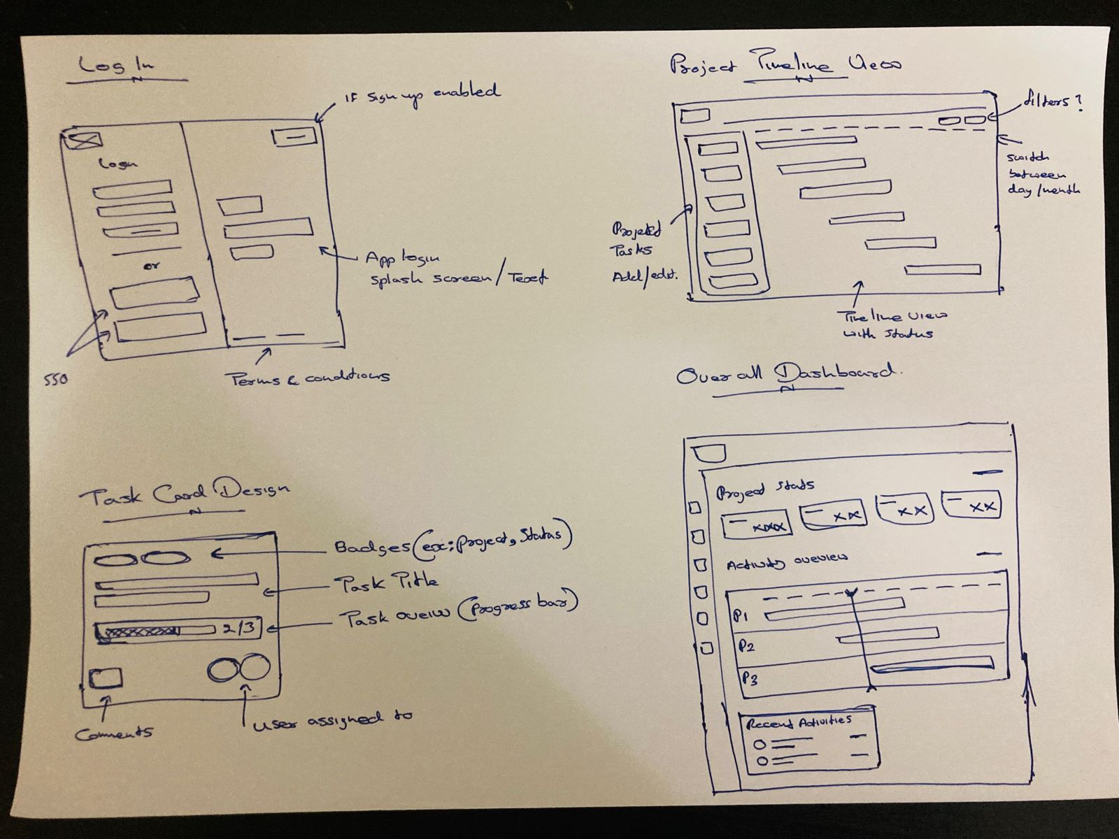
Sketching.
Next in the Design Thinking Process was the idealization part, which i managed to analyze couple of competitor products out there (Suggested by Chat GPT) to come up with couple of solution ideas.
Key Takeaway:
Due to the time constraint these sketches were directly converted to core wire-frames and high fidelity prototypes skipping the solution validation step with stakeholders.
Prototype.
High Fidelity Design.
I’ve used Figma to design the UI’s considering Accessibility standards. Here are couple of UI’s.

Task Reflection.
Design Choices
The product was designs based on clear assumptions and ready to test with real world users. However I’ve used standard mental models for layouts and Contrast color choices for better accessibility.
Business Analysis
I started off by gathering the core requirements and building hypothetical use-cases around the requirements. This helped me to understand the requirement deeper and to come up with questions related to these core requirements.
Use of “Solution Diagram” and a Sitemap helped me to understand the overall design and how to structure the information architecture of the product.
Feature Implementation
I would work with the stackholders to build a MVP roadmap and to lock on with the core features required for the solution. Any additional features/ Change Requests (CR’s) would be discussed/agreed up on to add on to the roadmap.
These additional features/ Change Requests (CR’s) will be put through to the Design Thinking process and finalized before implementation.
What could have been done better.
/ It would have been better if i could have had discussions with stockholders to understand problems better by designing a few “Mind Maps” based on users.
/ I could have designed the UI’s following a component & variable approach.
/ I could have designed the High Fidelity Wire-frames prior to the task submission so that i could have tested for a better understanding of the solution, experience with colors & interactions.
/ I could use a mental model such as the Think Aloud method to get a more accurate output.